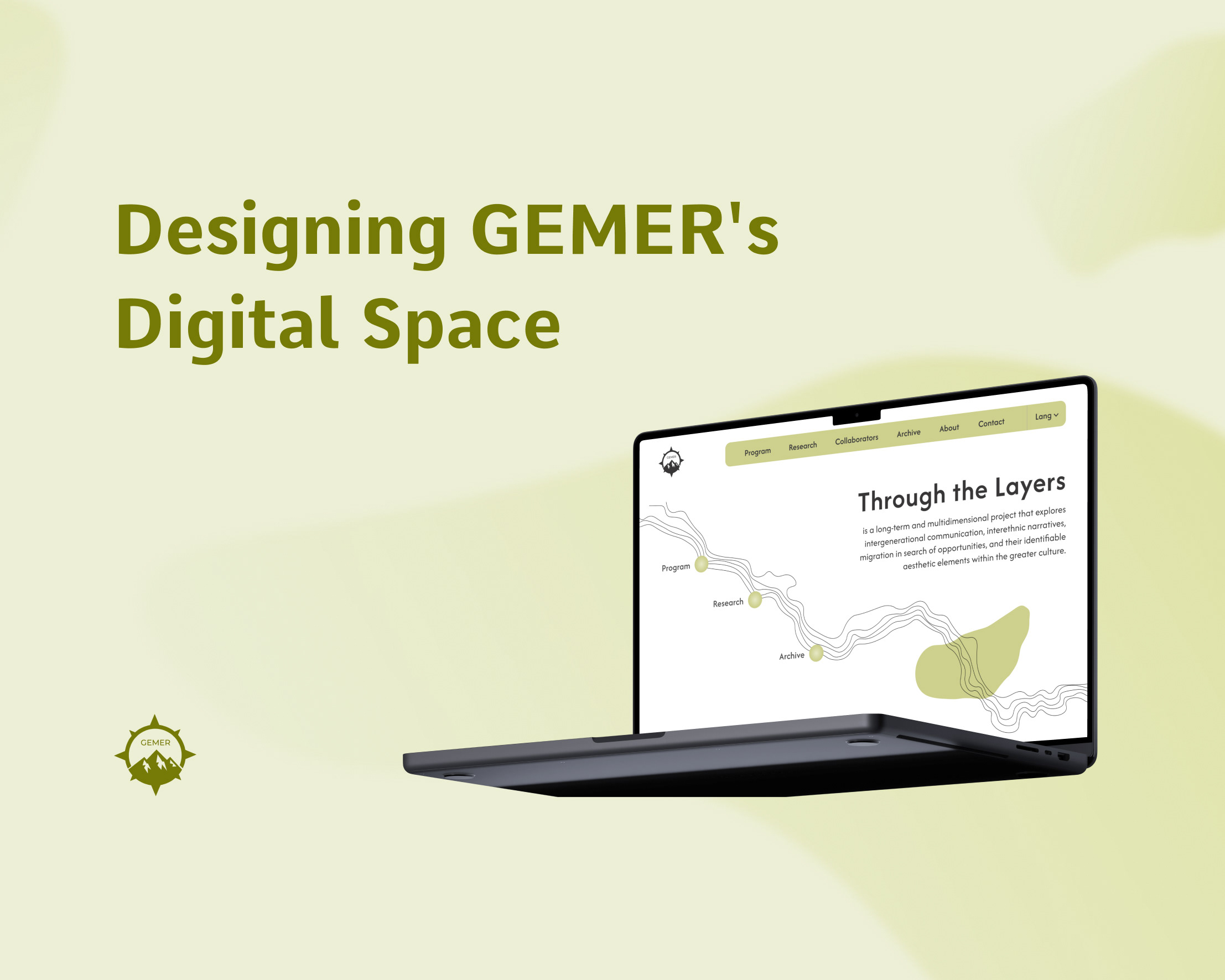
This project was a website designed to promote and facilitate participation in a short exhibition held in a non-traditional location. The site provided essential information about the exhibition, guided visitors to the venue, highlighted the program, and reflected the exhibition’s unique visual identity.
Overview
Goals & Parameters
1. Increase Visitor Attendance
2. Promote Active Participation in the Program
3. Maintain Visual Consistency with Exhibition Branding
Design Decisions & Impact
1. High Number of Visitors
The impact of this design decision is reflected in the KPIs: out of approximately 300 website visitors, around 250 were based in Berlin; the target audience able to physically attend the exhibition. Of these, 120 unique visitors attended the show over its eight open days, meaning nearly 48% of local site visitors converted into actual exhibition attendees, demonstrating that the website effectively guided audiences to the venue.
2. Consistent Program Attendance
Another key goal was to ensure that visitors could easily engage with the exhibition’s program without feeling overwhelmed. For this, I designed the program section to display only the next upcoming event, ensuring that visitors were always presented with relevant information. A “View Full Program” option gave users access to the complete schedule on a separate page, while the main page remained clear and focused.
This combination of clarity and convenience proved effective: visitors consistently encountered events they could immediately act on, and many chose to save them, which encouraged higher attendance and reduced drop-off. After the exhibition ended, the program remained online for documentation purposes, with clear labels indicating that events had concluded—preserving both usability and archival value.
3. Carrying the Exhibition’s Visual Identity
A central requirement of the project was to ensure the website reflected the exhibition’s distinct visual identity, maintaining consistency across physical and digital formats. I translated the poster’s dynamic background into the site’s design, creating a seamless visual connection between online and offline. This continuity reinforced the exhibition’s branding and helped audiences immediately recognize the project across multiple touchpoints.
4. Extending the Project’s Impact
While developing the site’s visual identity, I spotted an opportunity to go further. The exhibition’s posters had strong visual appeal, and I recognized their potential as collectible objects. To extend the project’s impact and support its limited budget, I designed a section of the site where visitors could purchase the posters as prints.
This addition transformed the posters from a purely promotional tool into a form of crowdfunding. It gave visitors a tangible way to support the project while taking home a piece of its visual identity. The approach both raised additional funds and deepened audience engagement by turning the graphic language into something people could own and display.
Recap
This project was more than a promotional website — it acted as the exhibition’s digital entry point, guiding audiences from discovery to attendance. By making the location intuitive to find, simplifying the program into timely and actionable information, and maintaining a consistent visual identity, the site successfully translated online interest into real-world participation.
