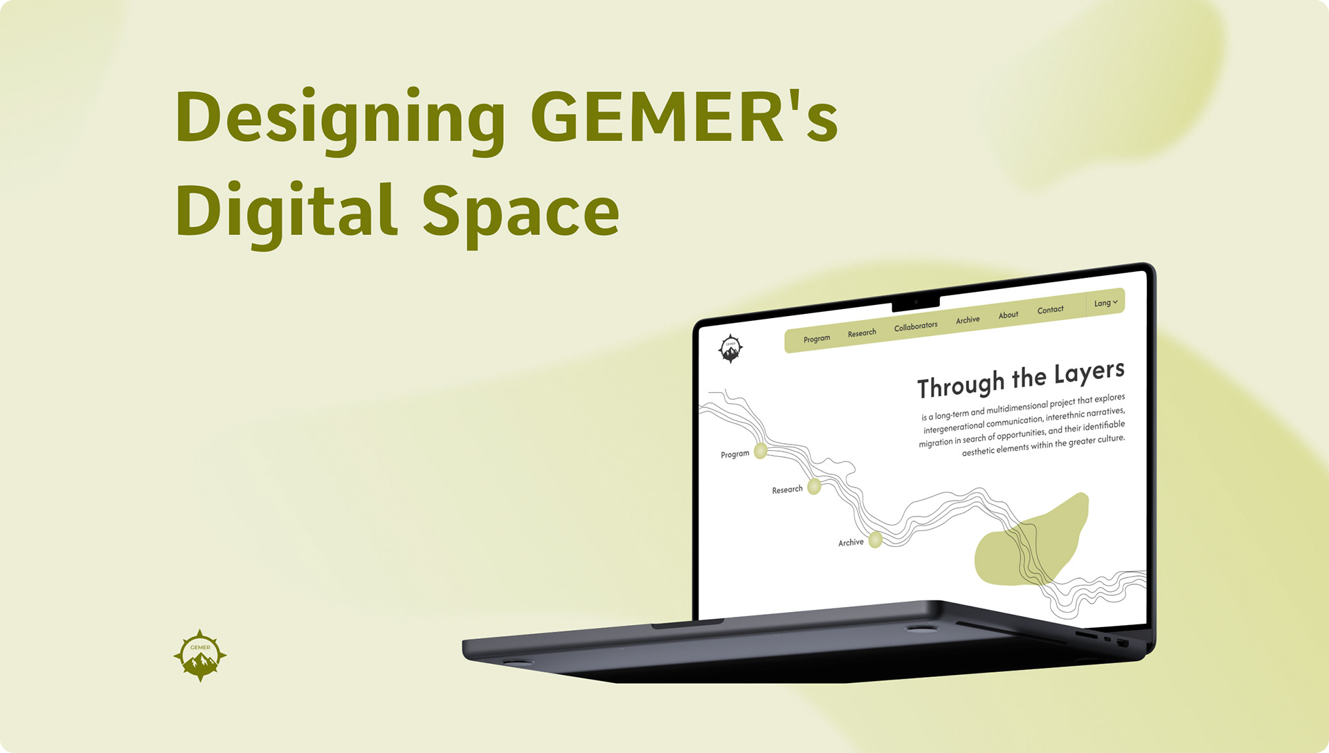
Revisiting my previous work for Gemer's "Through the Layers" website, this redesign builds on the original by improving visual hierarchy and interactivity - creating an engaging experience that aligns with the project's multidimensional goals.
Overview
Project name: Through the Layers/Gemer
Duration: 2 weeks
Role: UI/UX Designer, Web Designer, Brand Designer
Context
● Concept: Through the Layers is a long-term art project rooted in the mining history of Gemer, exploring intergenerational communication, migration, and the neglected narratives of its multiethnic community. By connecting the past and present of the region through artistic, historical, and community-driven initiatives, the project aims to foster dialogue and give voice to those often overlooked.
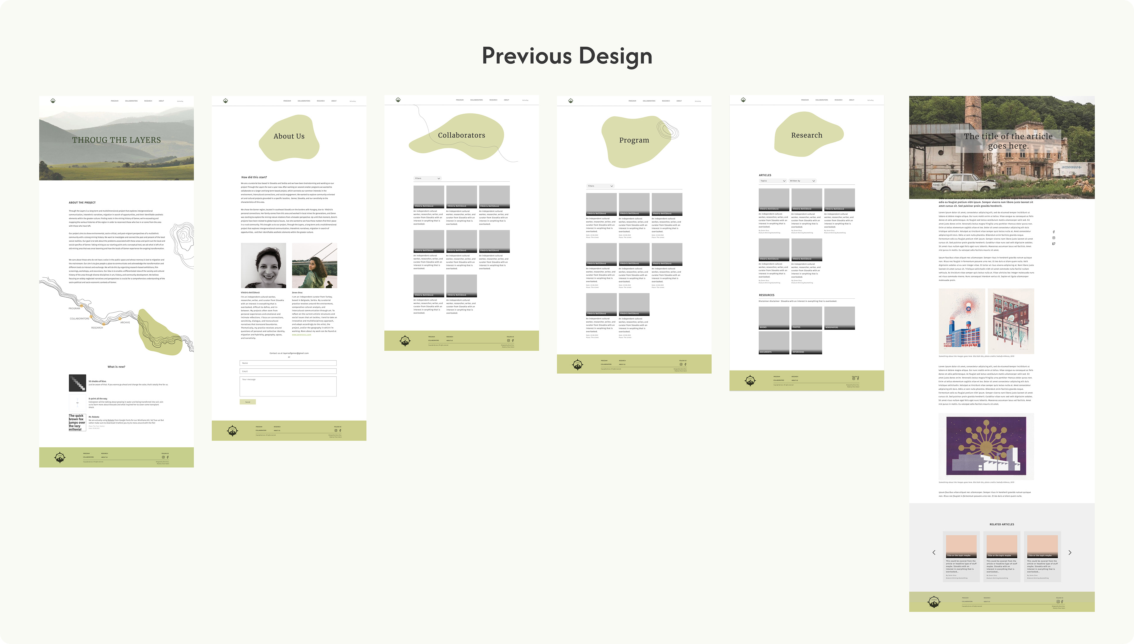
● Initial Website Focus: The original website design aimed to provide an accessible platform for older, non-tech-savvy users in the region. It served as a straightforward space for exploring the project’s events and engaging with its community-focused activities. Given the project's limited budget and technical resources at the time (2021), I had prioritized simplicity and usability, reflecting the early emphasis on fostering connection and accessibility within the region.
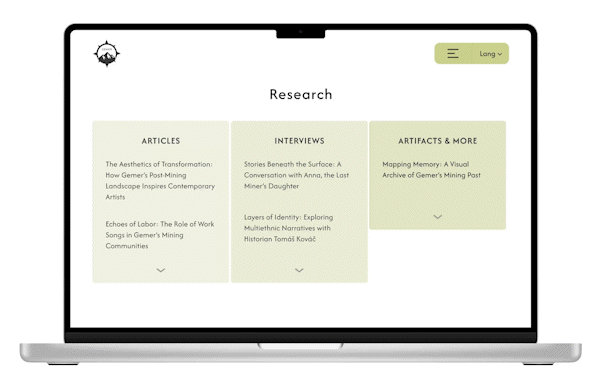
● Evolving purpose and needs: As the project grew, its focus expanded to highlight the research and archival aspects that underpin its long-term impact. These components, designed to resonate with younger audiences—including those outside of the region—required a fresh approach to the website’s design. This shift presented an opportunity to infuse the platform with creativity and interactivity, aligning its digital presence with the project’s artistic and research-driven nature, while retaining accessibility for older users.
Challenge
Key design challenges identified:
● The original design didn’t adequately highlight the archival and research aspects, which became the long-term core of the project.
● The artistic nature of the project wasn’t reflected in the website, leading to a disconnect between its content and presentation.
● Limited budget initially constrained the ability to introduce creative, playful, or unique design elements.
Target audience challenges:
● The younger, more digitally-savvy diaspora audience required a more visually engaging and interactive experience to connect with the platform.
● Balancing usability for the original audience (older, less tech-savvy users) with new requirements posed a significant design challenge.
Transformation
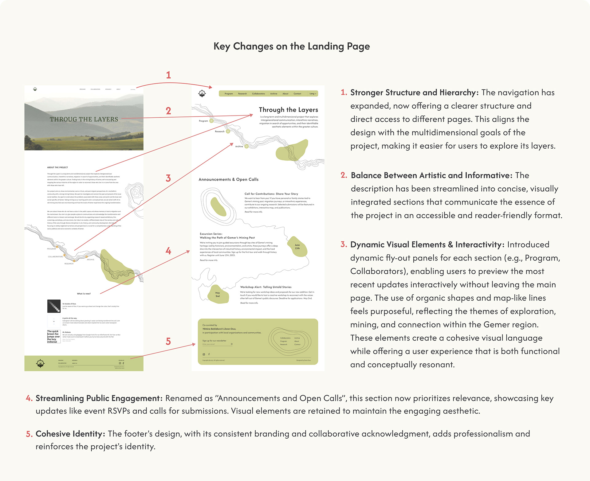
I revisited the original design with a focus on evolving the platform’s purpose and audience needs. The primary goal was to integrate creative storytelling, artistic quality, and playfulness into the design while maintaining accessibility.
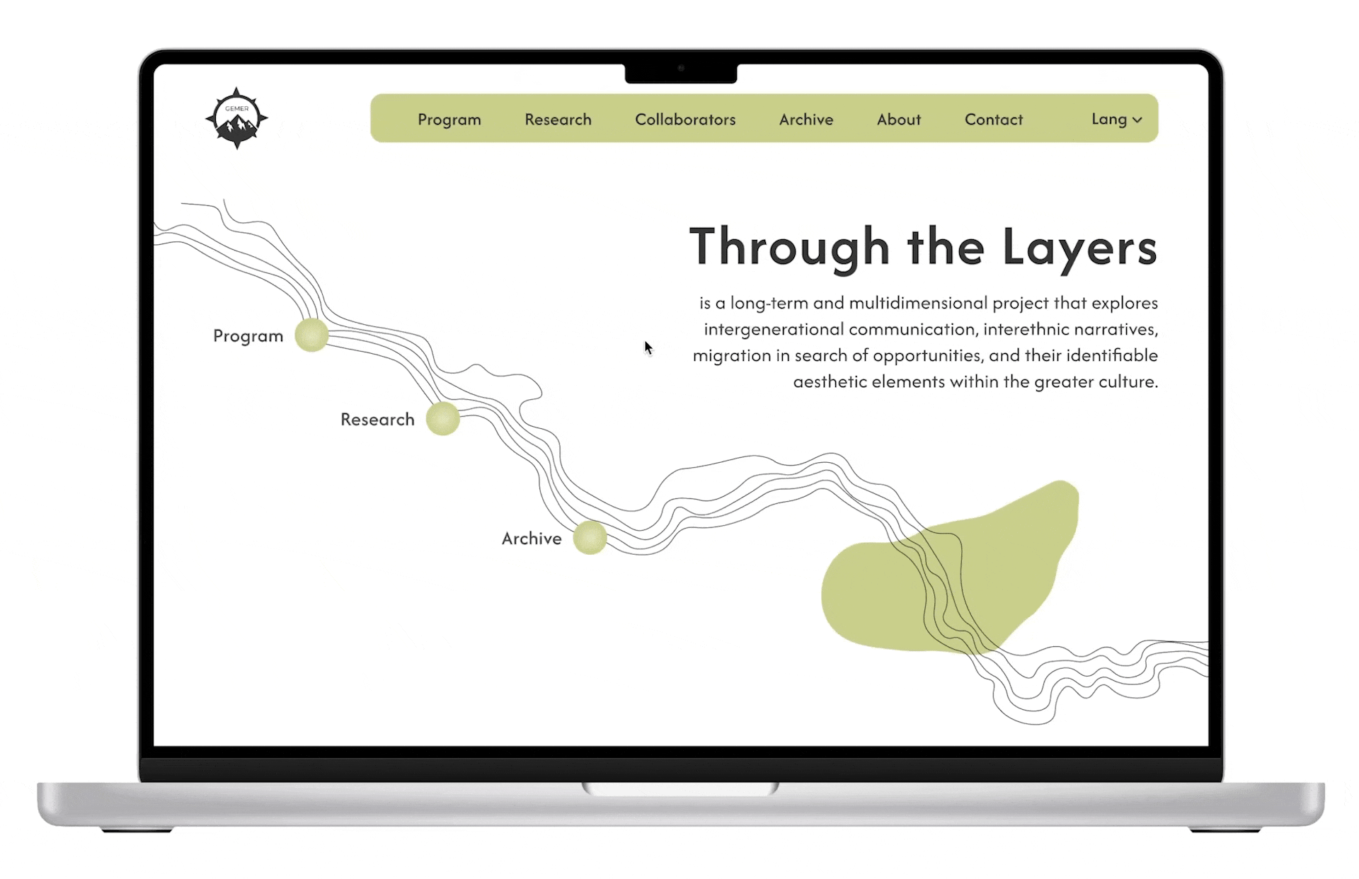
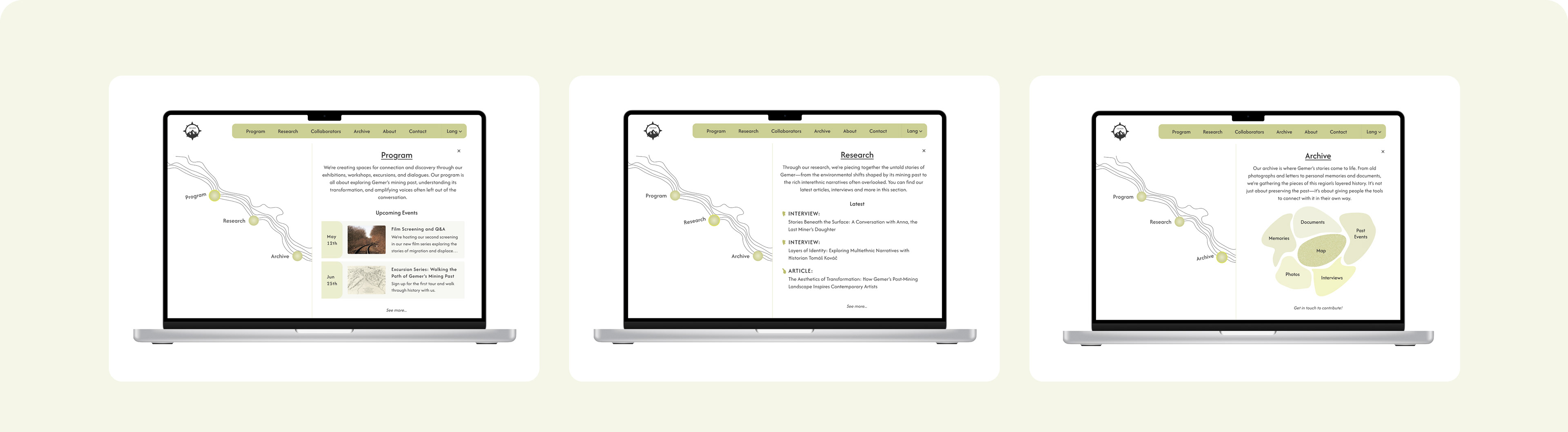
The redesign focused on enhancing usability, improving visual hierarchy, and integrating interactive elements. These updates were essential to better represent the project’s themes of connection, exploration, and transformation while ensuring the platform remained inviting and intuitive for all users.
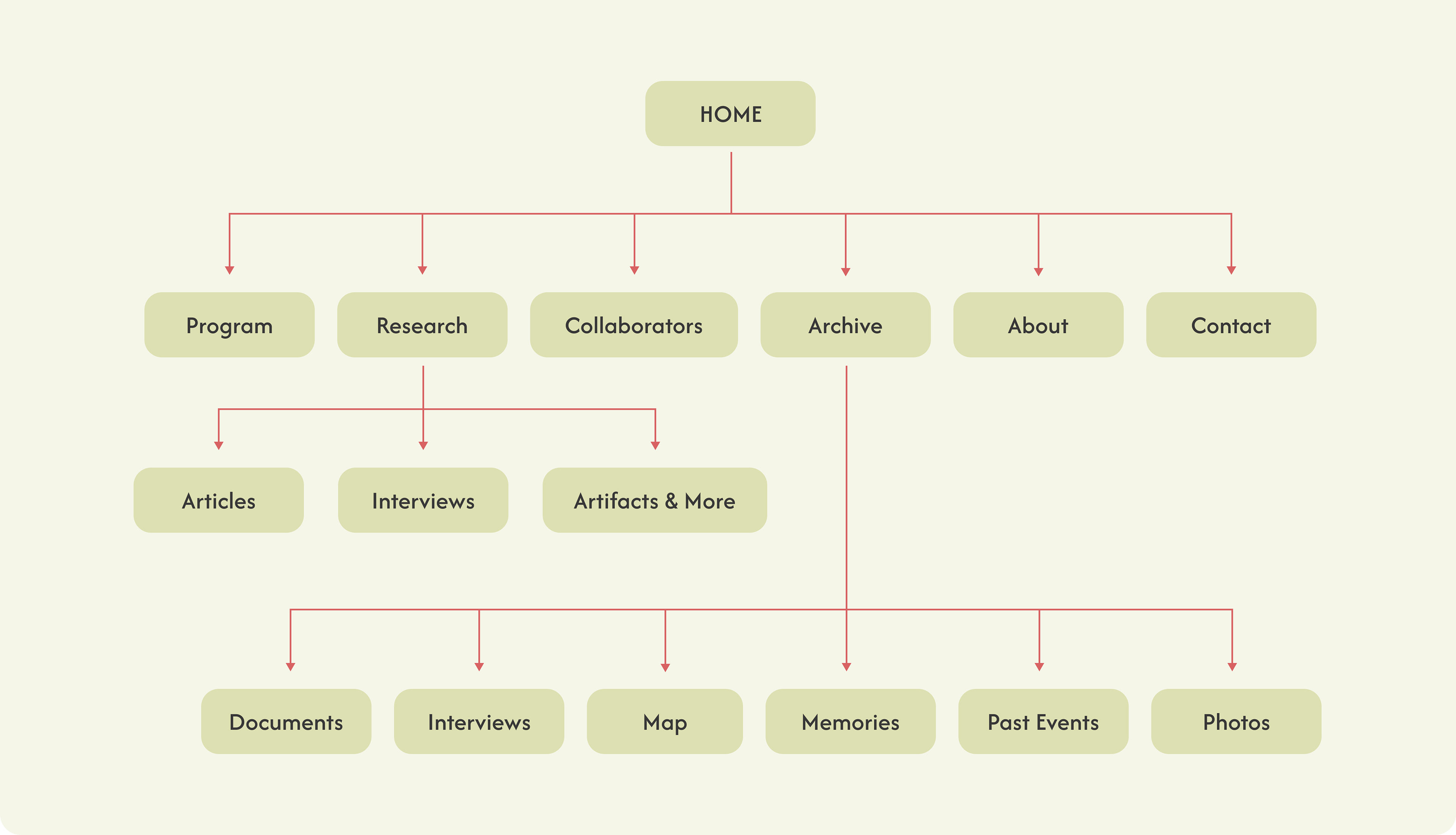
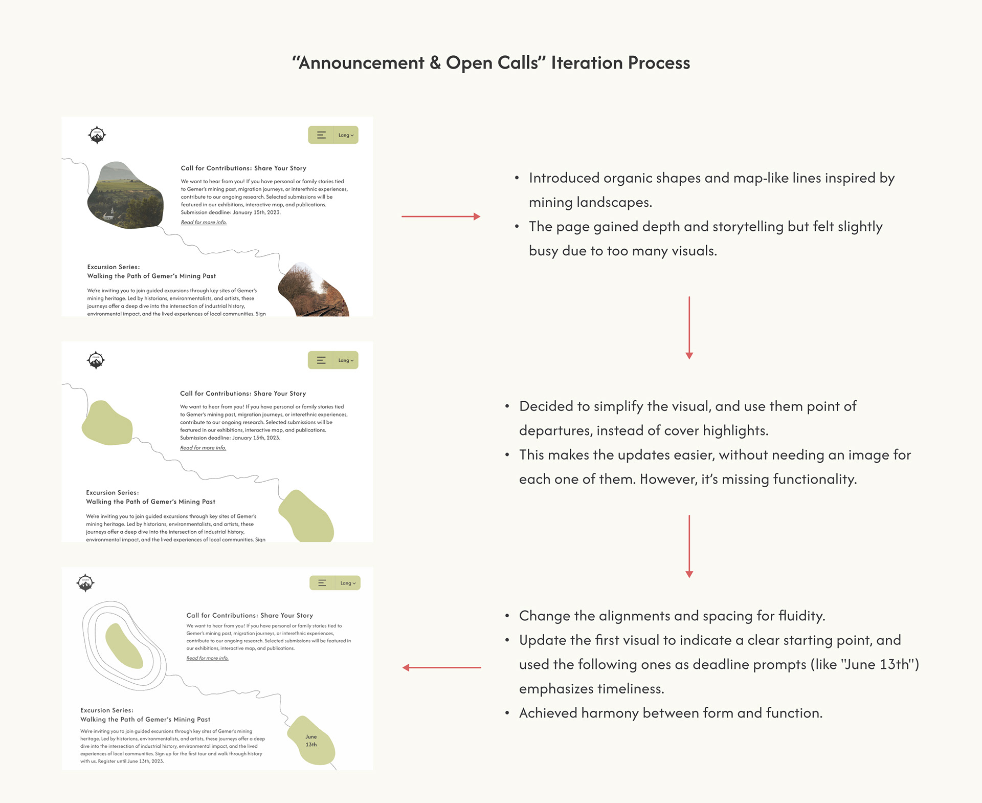
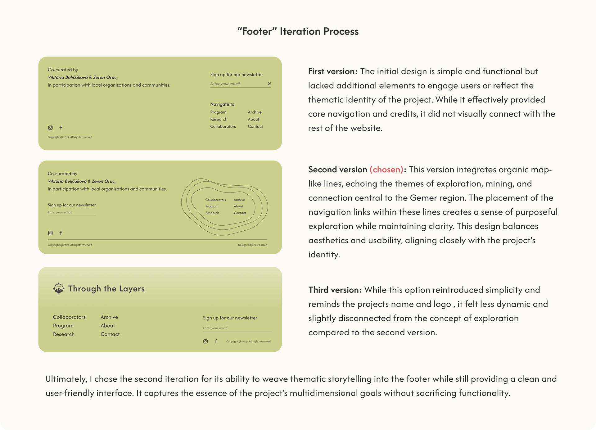
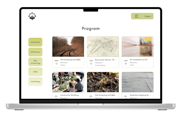
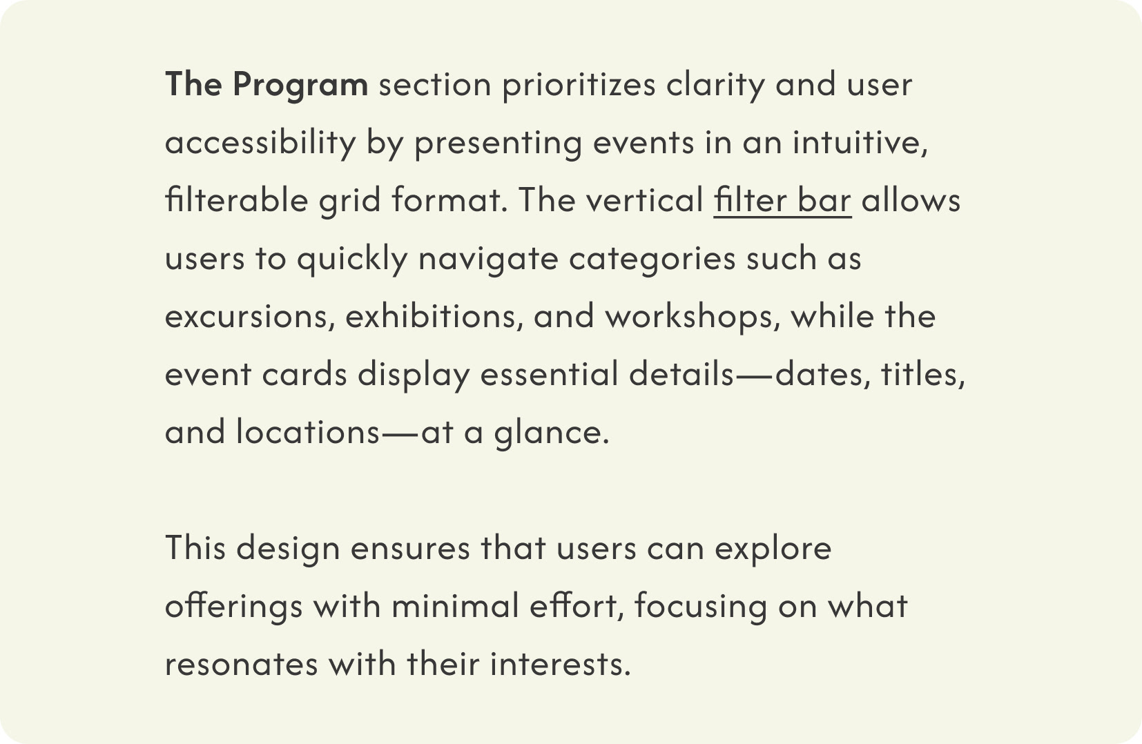
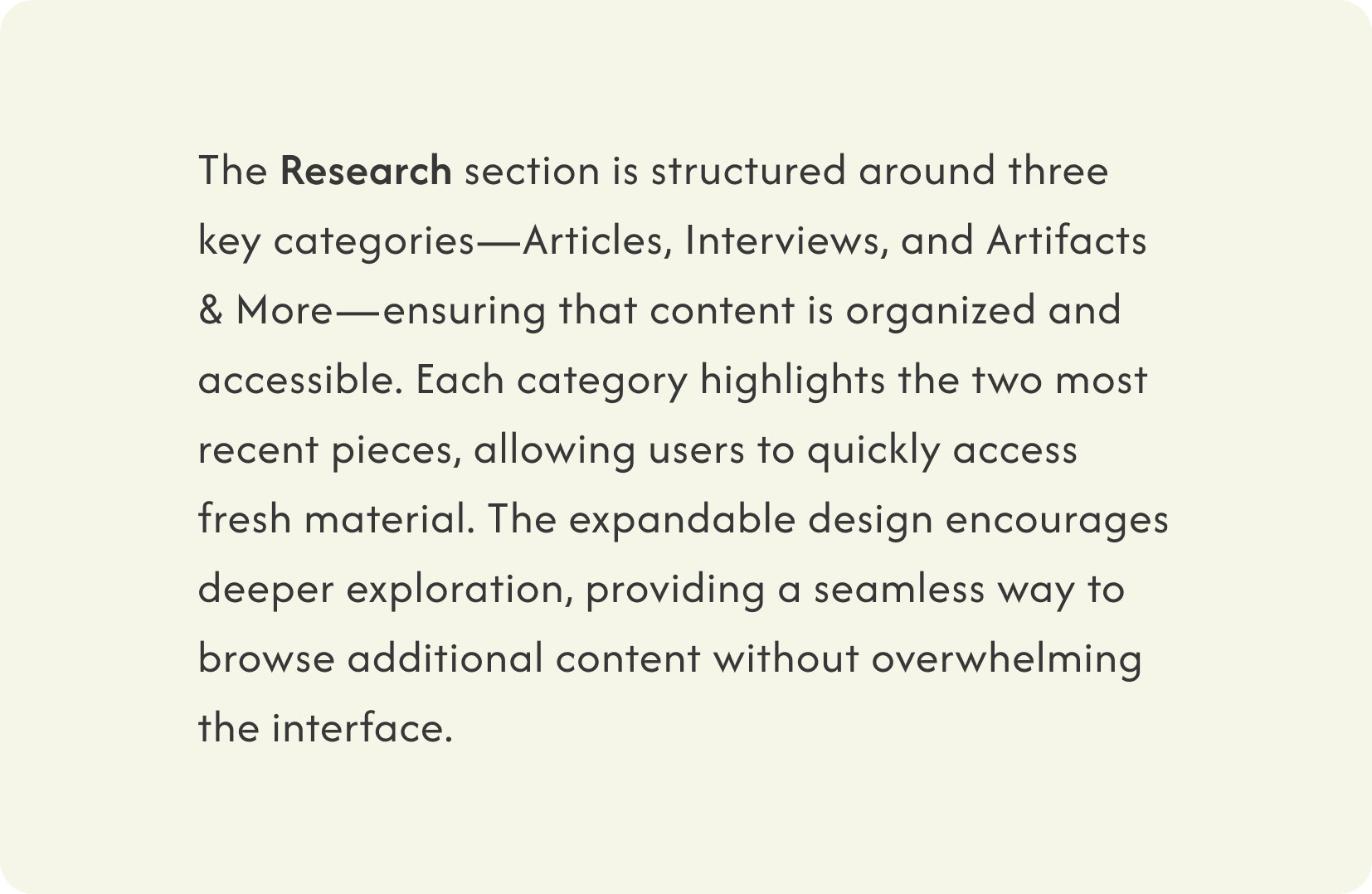
The following sections highlight key changes to the landing page and the iterative design process for the "Announcements" and "Footer" sections. By showcasing three iterations for each, this breakdown illustrates how the refinements enhanced usability, functionality, and visual alignment with the project's overarching goals.
Reflections
Redesigning the "Through the Layers" website offered a unique opportunity to revisit my own earlier work and improve upon it with a fresh perspective. This process was as much about refining functionality as it was about deepening the visual and conceptual alignment with the project’s core themes of exploration, mining, and connection.
One of the most rewarding challenges was creating a design that balanced aesthetics and usability while respecting the project's multidimensional goals. Iterating on specific sections like the Announcements and Footer helped me focus on delivering not only visually appealing elements but also features that enhance user engagement and clarity.
This redesign emphasized the importance of flexibility and user-centered thinking. By introducing interactive components, like the dynamic fly-out panels and improved navigation, I ensured the site could grow alongside the evolving needs of the project and its audience.
Looking back, the experience reinforced my belief in the iterative process: meaningful improvements come from revisiting ideas, seeking feedback, and continuously refining. This case study reflects not just a transformation of the website, but also growth in my own approach to design—one that prioritizes collaboration, intention, and the user’s experience above all.